A ring of pastel rainbow arcs framing a photograph of a teacher and children laughing together during a Raduzhniy class, with a band of the brand's pastel colours along the bottom edge.

Raduzhniy

case study

BrandingVisual identity

Радужный (rus. for ‘rainbow’) is an arts center dedicated to nurturing the creative talents of children. Specializing in piano and singing classes, as well as group and individual rhythmical and musical developmental sessions, the center offers a holistic approach to musical education.

Branding
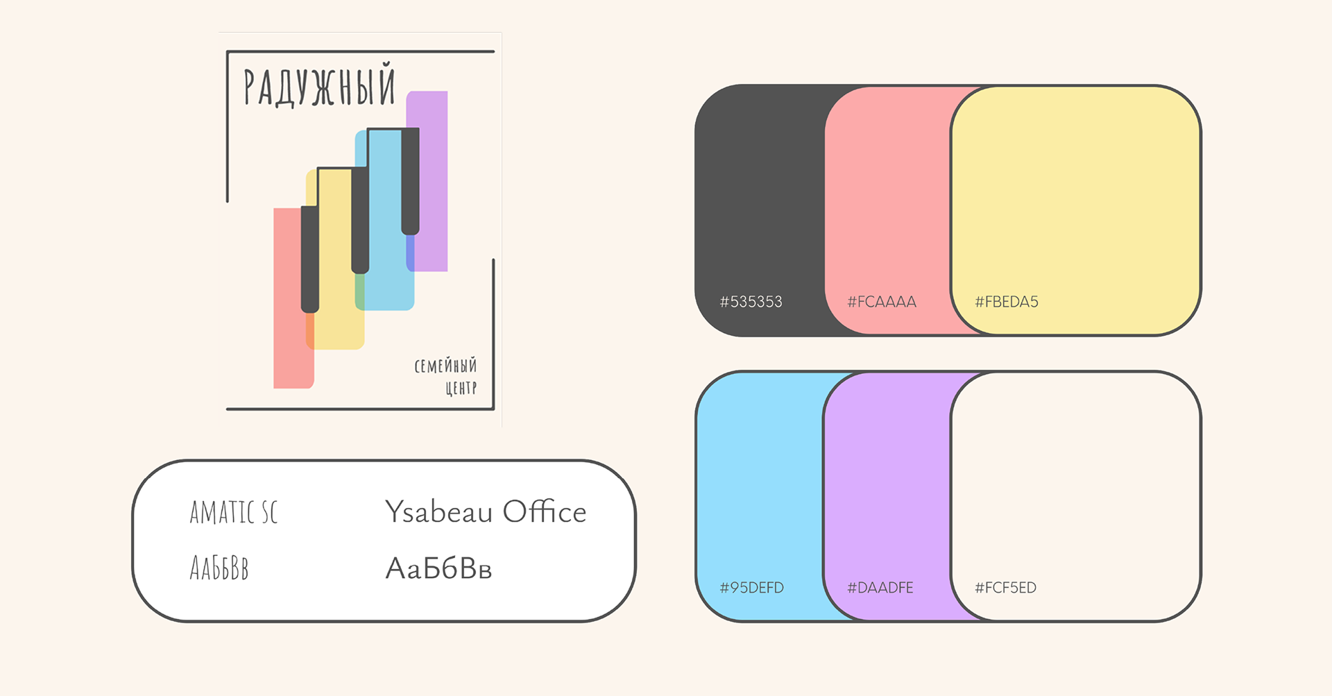
Type and colour specimen: the main vertical logo lockup, the palette — charcoal #535353, coral #FCAAAA, pale yellow #FBEDA5, sky blue #95DEFD, lavender #DAADFE and cream #FCF5ED — and a type sample card for Amatic SC and Ysabeau Office.
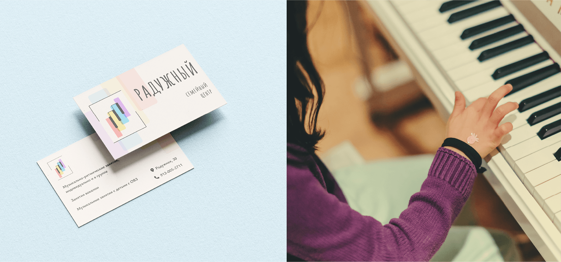
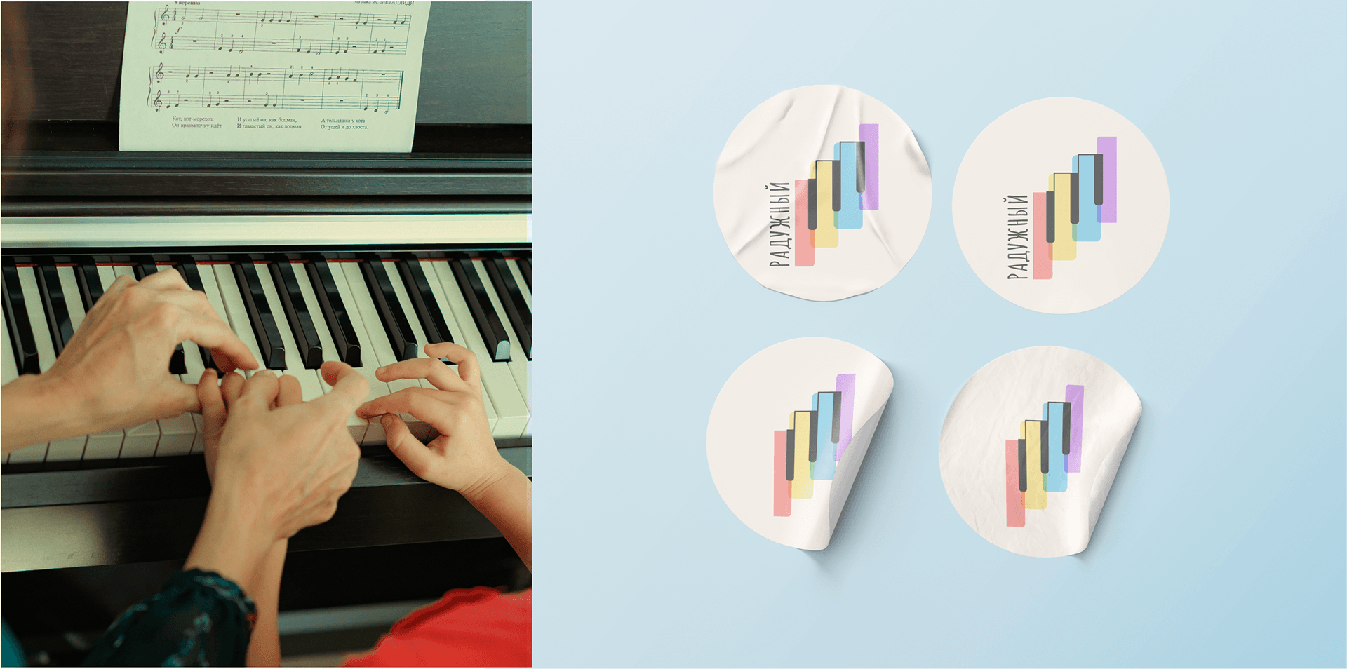
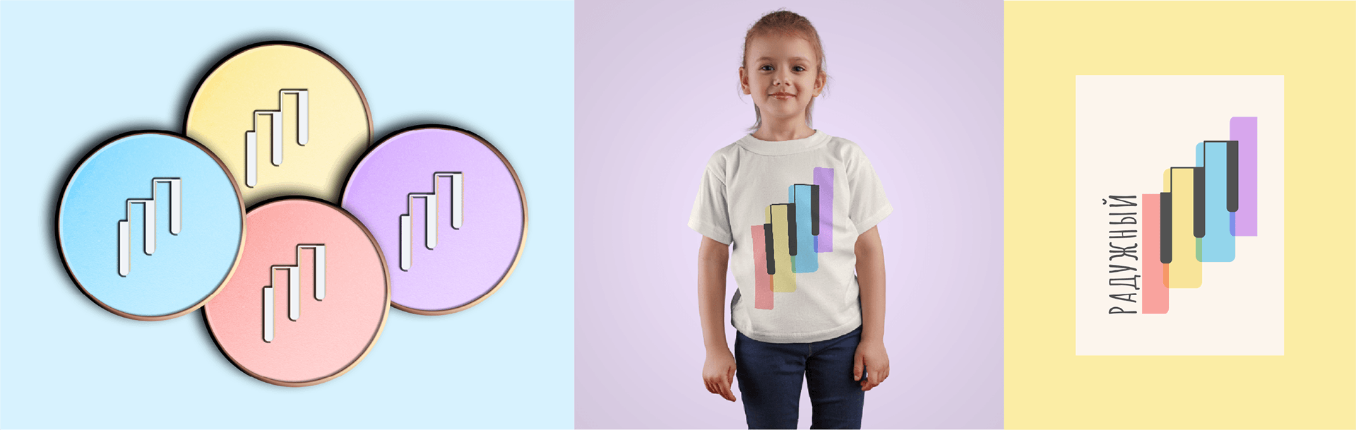
A folded business card on pale blue, showing the logo lockup and class listings on the front and back, beside a photograph of a child's hands reaching for piano keys. A teacher's and child's hands placed on piano keys beneath sheet music, beside four round stickers carrying the vertical logo lockup. The piano-key mark repeated across four overlapping enamel-pin-style badges, a child modelling a t-shirt printed with the mark, and the logo set on a cream card against a yellow ground.