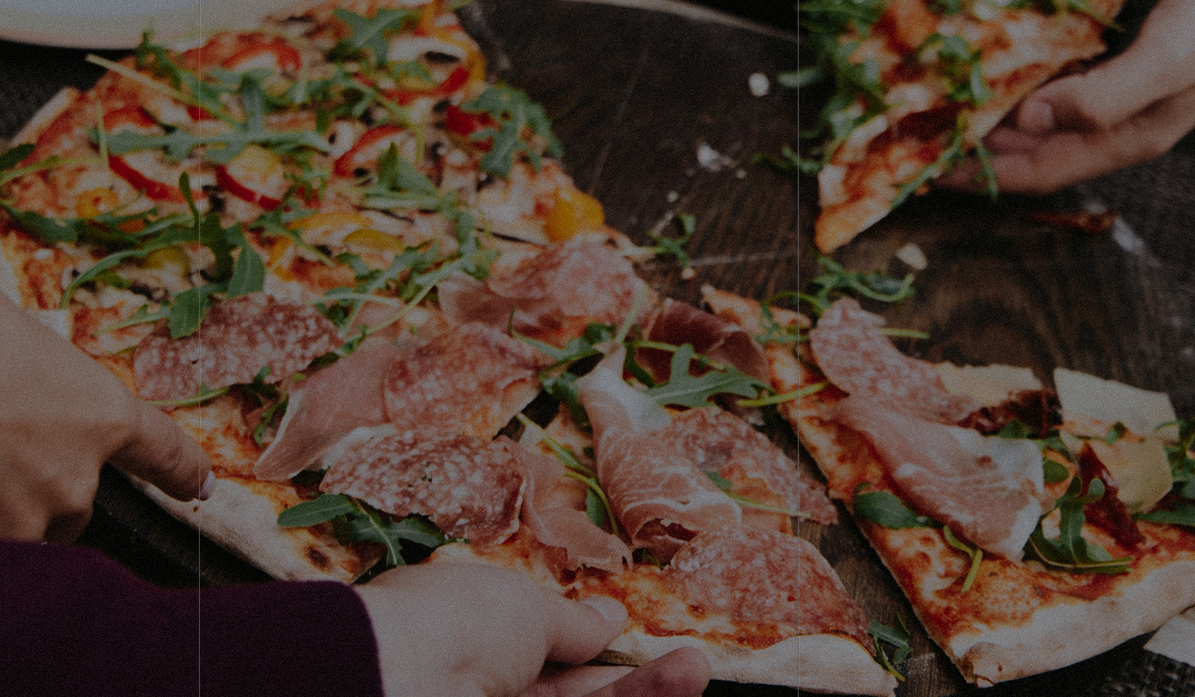
A close-up photograph of a pizza topped with prosciutto, salami, arugula and peppers being shared at a wooden table.

Trulli

case study

BrandingLogo designPackaging

Trulli takes its name from the cone-roofed stone houses of Alberobello, Italy — and its mark from the same shape: one unbroken line that loops from a pasta coil into a pizza slice's curve. That single line carries through packaging, signage and print, built to feel handmade rather than corporate: a different kind of pizza, made simply.

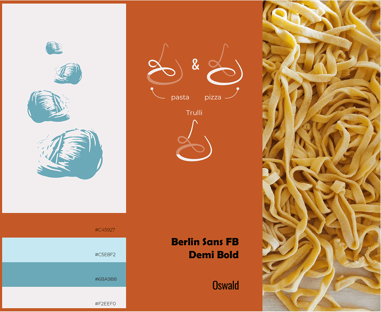
The identity specification board: a stack of pasta-coil illustrations in teal, the monogram taken apart to show how the "pasta" loop and the "pizza" curve combine into the Trulli mark, a swatch stack giving #C45927, #C5E8F2, #6BA9B8 and #F2EEF0, the typefaces Berlin Sans FB Demi Bold and Oswald, and a photograph of fresh tagliatelle.

Packaging

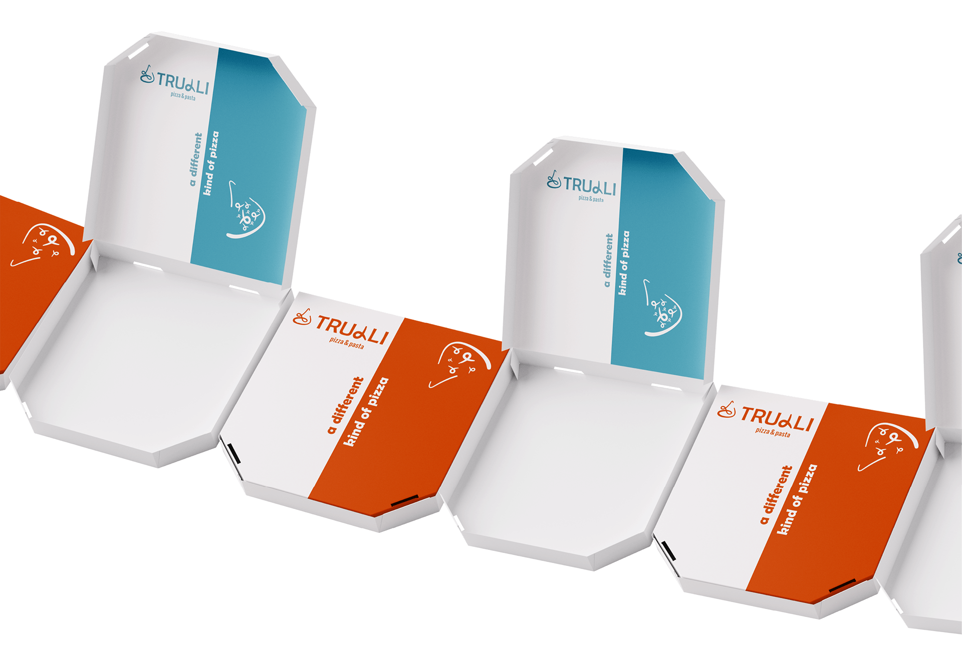
Four Trulli pizza boxes photographed from above in a diagonal run, their side panels alternating burnt orange and teal against white card, each carrying the logo, a line-drawn pizza icon and the strapline "a different kind of pizza".
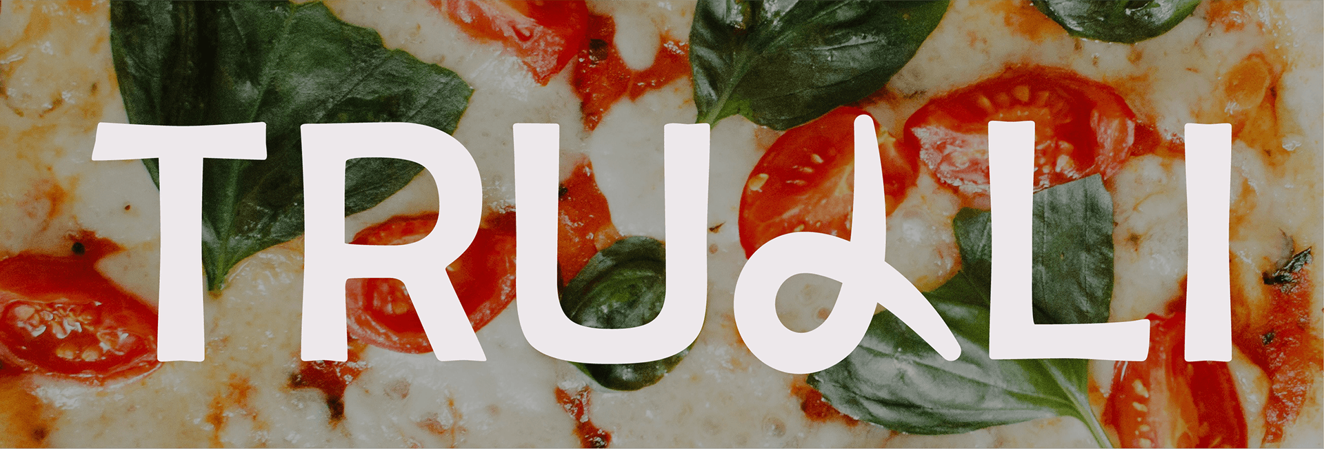
The TRULLI wordmark in off-white lettering across a close-up of a margherita pizza scattered with basil leaves and blistered cherry tomatoes.