Madison & Beyond case study cover: the logo mark and wordmark on a dark espresso ground with a dashed contour-line texture.

Madison & Beyond

case study

UI/UXVisual designBranding

Madison & Beyond realty, a real estate agency rooted in the heart of Wisconsin. This project began with a visual identity — crafting a logo and brand system that captures the warmth and reliability of local homebuying. The brand then naturally extended into a clean, welcoming website that reflects the values of Madison's close-knit communities.

Branding
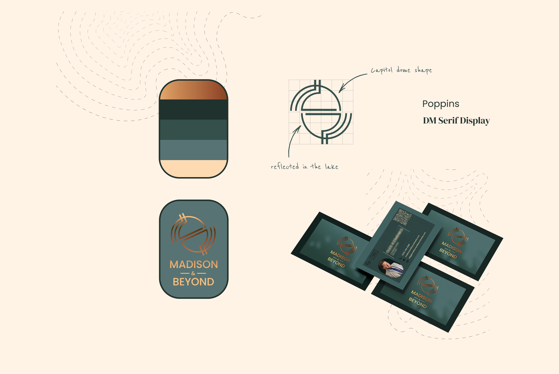
Brand system on cream: a five-colour swatch stack from copper through deep pine to sand; the logo mark's construction, annotated as the Capitol dome shape reflected in the lake; the Poppins and DM Serif Display typefaces; and business card mock-ups.

Website design

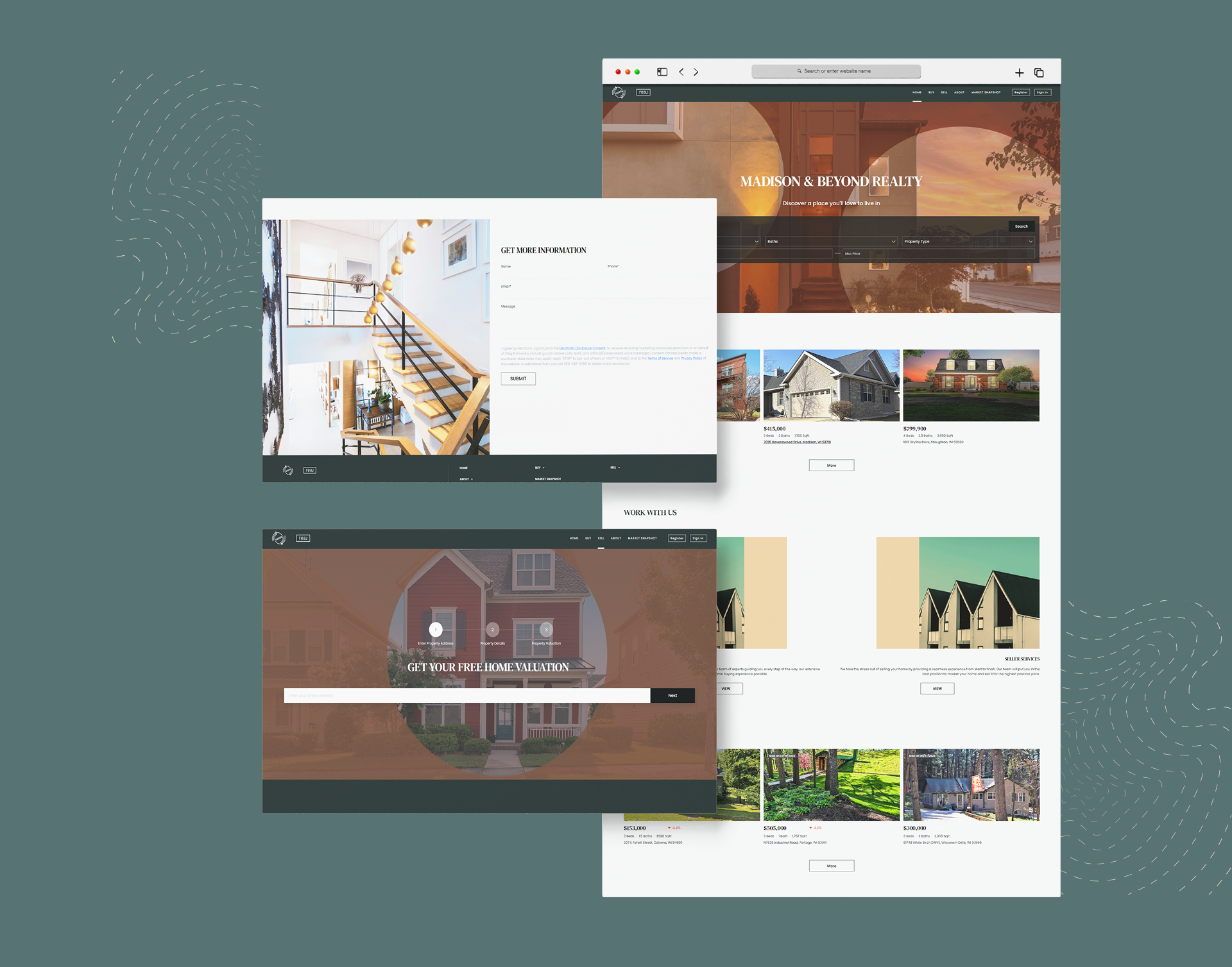
Website design on sage green: the Madison & Beyond Realty homepage with property search and listings, a get-more-information contact form, and the get-your-free-home-valuation flow.